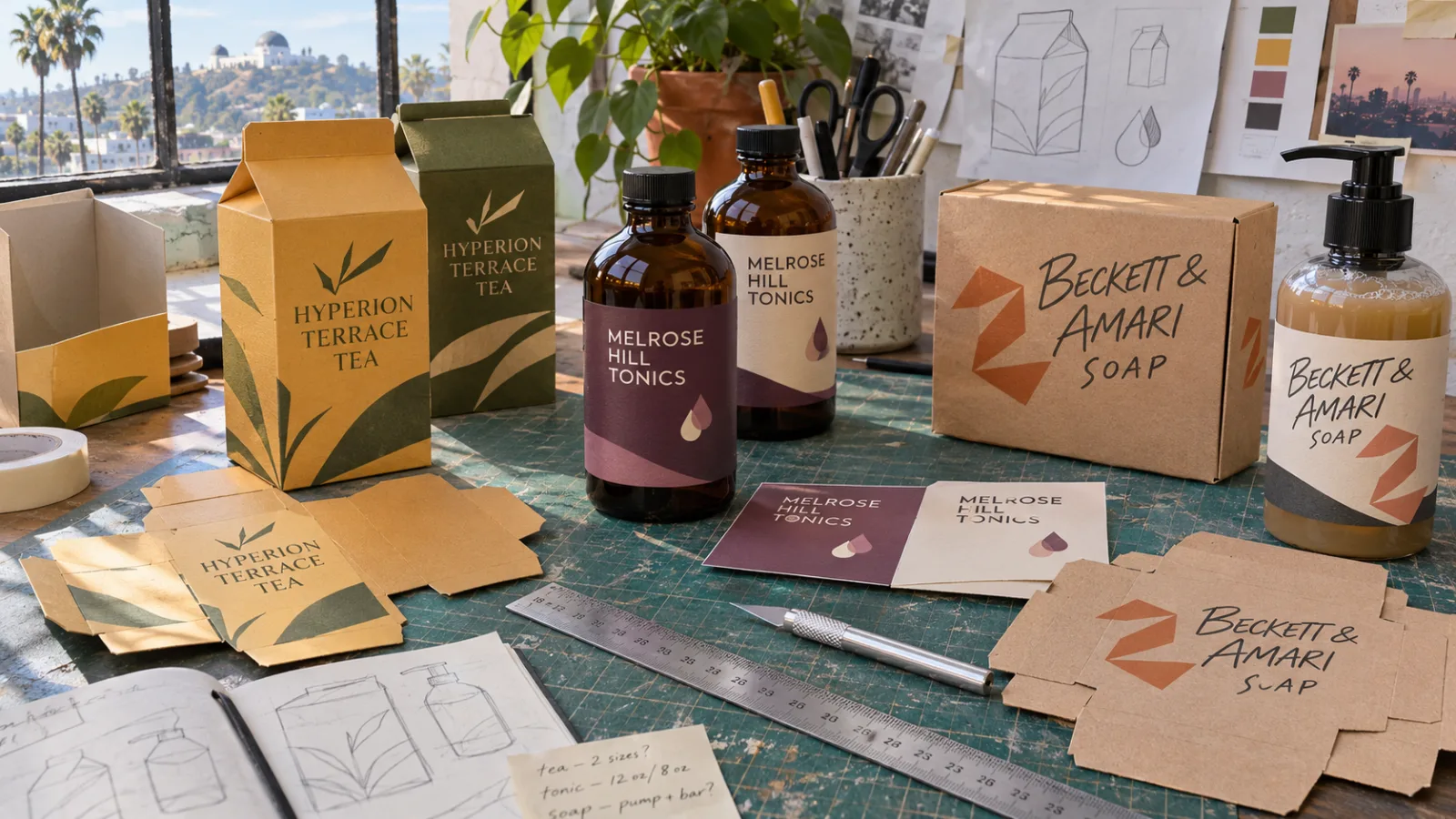
A packaging prototype, or comp, is a sample made to look exactly like the finished package. It wins approvals, photographs well and catches problems before you spend on a full production run.
Three reasons to use professional comps
1. Sell the idea before the factory run
Buyers, clients and bosses say yes faster when they can hold the real thing. A flat drawing on a screen does not do that.
2. Catch problems early
A real sample shows if text wraps into a fold, a color looks wrong or a label does not fit the bottle. Fixing a comp costs far less than fixing a production run.
3. Get photos and props before launch
Comps let you shoot product photos, ads and sell sheets before the first run is made. Film and TV crews use them as props that hold up on camera.
What we make
- Box and carton comps, printed, cut and folded to your dieline
- Label mock-ups in full color on real bottles, jars and cans
- Sleeves and cartons for retail and gift packs
- Rub-on decoration for printed-on looks on glass, metal and plastic. See rub-on transfers.
- Props for film and photo
Finishes include foil, metallic and Pantone colors. We make one-offs and short runs.
Packaging design tips
- Make the brand and product name the first thing people see. Shoppers scan a shelf in seconds.
- Say what it is. A clever name is great, but the package must say what is inside.
- Design every side. Shelves, boxes and online photos all show different faces.
- Keep the front clean. Move details to the back and sides.
- Test it at shelf distance. Put the comp on a shelf and step back.
- Know your rules. Food, health and beauty products have labeling rules. Check them before you finalize.
How to choose packaging colors
- Start with your brand colors so the package looks like you.
- Look at the shelf. If every competitor is blue, a different color stands out.
- Think about meaning. Greens often say natural, black and gold often say premium, bright colors often say fun.
- Call out Pantone numbers so the color matches from comp to production.
- See it printed. Colors on a screen look different on board, film and foil.
What hurts packaging
- Too many fonts and colors
- Small, low-contrast text
- Copying the market leader so closely that shoppers mix you up
- Skipping a physical sample before production
How to order a comp
- Send PDF or AI files with your colors marked, built on your dieline.
- We confirm size, colors and finish.
- Your comp is printed, trimmed and assembled by hand.
Packaging prototype questions
What is a packaging comp?
A comp is a one-off or short-run sample made to look like the finished package for pitches, photo shoots and buyer meetings.
What files do you need for a packaging prototype?
PDF or AI files with your colors marked, built on your dieline.
Can you match Pantone and foil colors?
Yes. We print foil, metallic and Pantone colors.
Can you make labels for real bottles and cans?
Yes. We make full-color labels on real bottles, jars and cans, and rub-on transfers for a printed-on look.
See our packaging prototypes page for photos and options.
Get a free estimate
Tell us what you need and where it goes. We will send a free estimate, and you will see a proof before anything prints.
Get a Free EstimateOr call (310) 323-5600, Monday to Friday, 8 AM to 5 PM.
